![[Translate to Englisch:] Responsive Website: damit ihr Internetauftritt auf allen Geräten immer optimal aussieht Tisch mit unterschiedlichen digitalen Geräten von oben](/fileadmin/_processed_/5/7/csm_Blog-Responsive-Website1_d4a0163a2b.jpeg)
Responsive website: how to optimise your website for all devices
What does responsive web design mean?
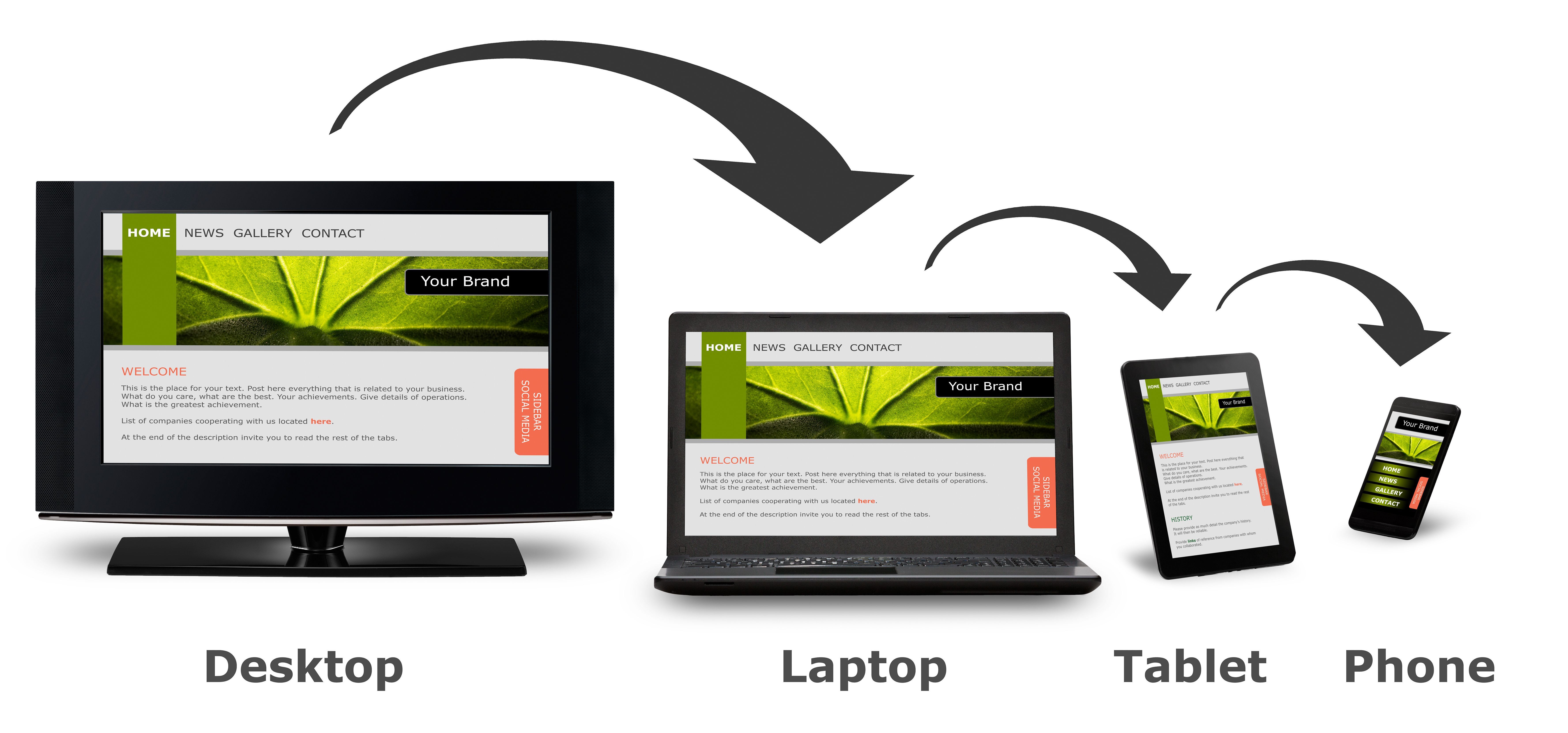
A responsive website automatically adapts to the screen size of the device used. This means that the website is displayed differently in the browser of a laptop than on a smartphone or tablet. All design elements, from images to font sizes, are displayed differently depending on the device. For example, if you have a photo gallery on your website, this will be adapted depending on the size of the browser window used. While the desktop version displays several images next to each other, the mobile version displays the images one below the other. This flexibility enables a consistent and appealing user experience on all devices. You determine which design is displayed when in the website code.

Why responsive web design is becoming increasingly important
Nowadays, most users access websites via their smartphone. It is therefore crucial that your website is optimised for smaller screens.
A study on the use of mobile devices for Internet access by Statista shows that the global share of mobile Internet use is already over 50% in 2023 and is growing at a steady rate.
Why you should pay attention to mobile-friendliness
Search engines such as Google rate the mobile-friendliness of a website as an important ranking factor. If your website is not optimised for mobile devices, you not only risk losing potential customers, but also a lower ranking in the search results. A responsive web design can help you to improve your visibility in search engines and thus generate more traffic.
In our blog on search engine optimisation, you will find useful tips on how your website can be found more easily.

Create your responsive website now
With web hosting from Green, you get access to an included website builder. You can access over 200 design templates and free images in one go. They are optimised for mobile phones and tablets so elements can be easily adjusted, repositioned and even hidden in the responsive display. Build your own responsive website with ease.
4 Tips for a successful, responsive web design
1. Reduce the number of design elements on mobile devices
Think carefully about which elements you want to display on the mobile versions of your website. As the user experience is different on smaller screens, you should avoid unnecessary text and images that could detract from the user experience. Place important elements such as call-to-action buttons strategically to ensure your visitors don't have to scroll unnecessarily.
2. «Mobile First»
Another important approach is mobile-first design. Design your website for mobile devices first and then create the versions for desktop screens. This will ensure that you focus on the needs of mobile users and increase your search engine ranking.
Don't miss out |
3. Choose the right menu
Typically, your website contains a navigation bar - at least in the desktop version.
However, there is often not enough space for this on mobile devices. This is where the hamburger menu comes into play, which consists of just three horizontal lines: a bun at the top and bottom and the filling in between. The hamburger is usually placed in the top right-hand corner of the mobile view. This reduced navigation ensures better clarity on smaller screens.
For the desktop version, it is advisable to retain a horizontal navigation bar to allow visitors to navigate easily.
4. Test your responsive website on different devices
Is your website responsive? Test whether it looks "good" on a smartphone, tablet and laptop. Also check what happens when you hold the smartphone in wide format, when you view your website on a tablet or when you reduce the browser window on a laptop. Everything still correct? This is the only way to ensure that the user experience is maximised on all devices.

Register your personal domain
Over 270 different top-level-domains (i.e. webiste names ending in .ch / .de / .com / .swiss) are available at Green. With our domain checker, you can check immediately whether your desired domain is available. If it is already taken, try another ending such as .swiss / .com / .org / .net and secure the name for your website.


